Herdade do Freixo
Identity
Packaging Design
2016
Packaging Design
2016
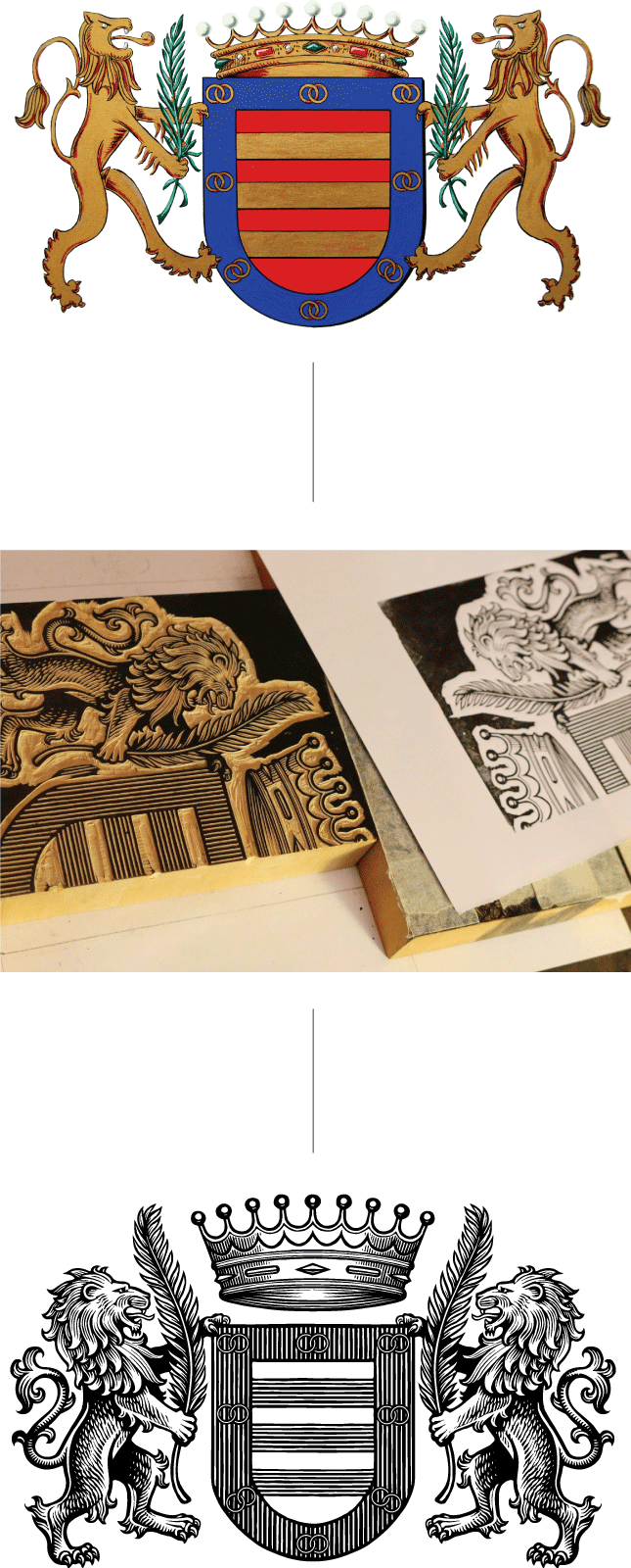
Visual identity and packaging design for a new wine estate in Alentejo, Portugal. The logomark created derives directly from a family-owned coat of arms, honouring hundreds of years of history linked to the unique estate’s region.
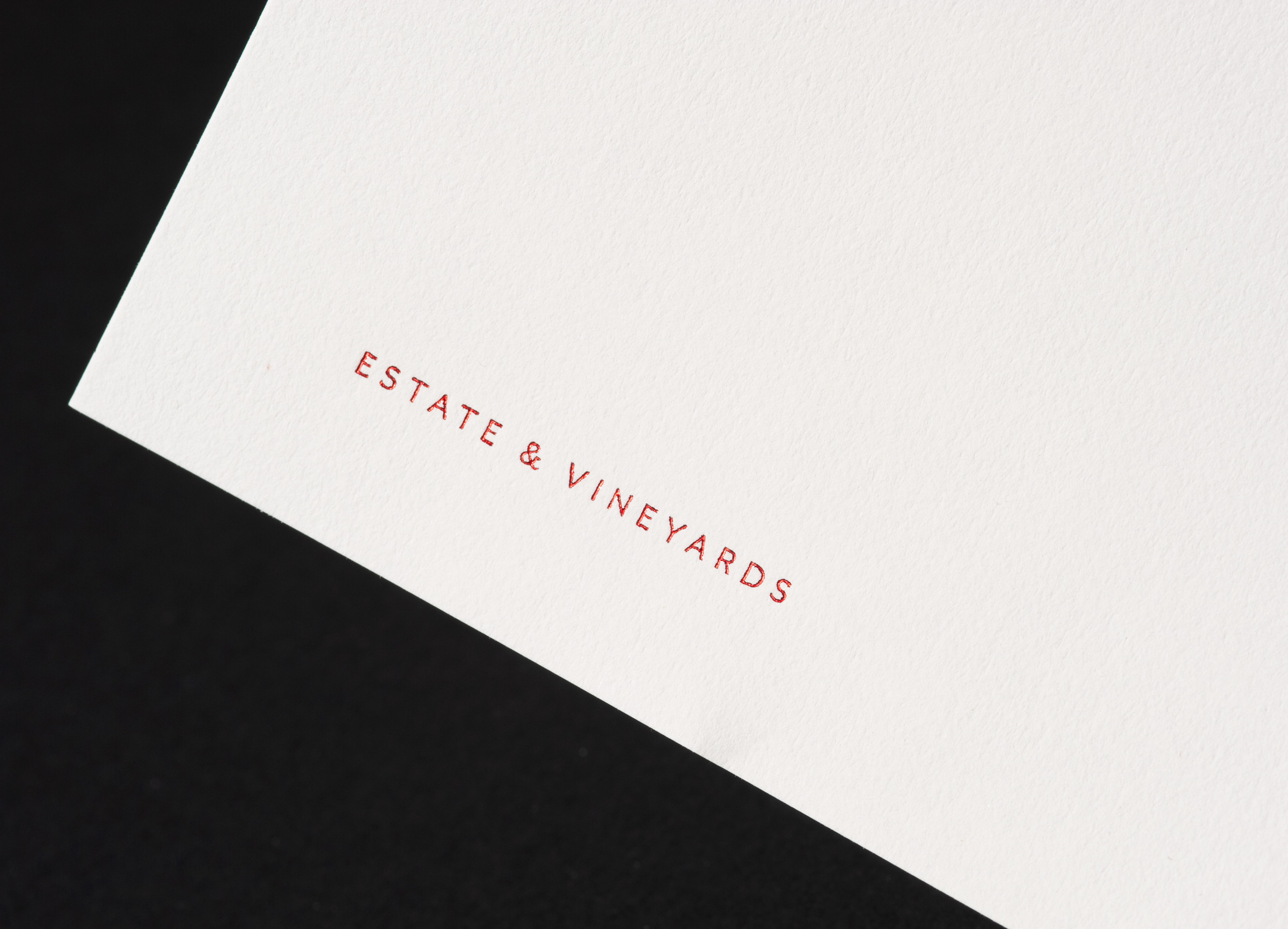
Herdade do Freixo’s production takes place in a unique winery built entirely underground, sitting seamlessly within the landscape. This quietness is weaved through the brand, using blind embossing on their institutional communication and wine labels.
Developed at
Herdade do Freixo’s production takes place in a unique winery built entirely underground, sitting seamlessly within the landscape. This quietness is weaved through the brand, using blind embossing on their institutional communication and wine labels.
Developed at

Herdade do Freixo’s original coat of arms lacked elegance and wasn’t flexible enough. Keeping its original construction and visual symbolism, we refined its drawing with the help of illustrator Christopher Wormell. The result was a crest elegant on both small and large applications.


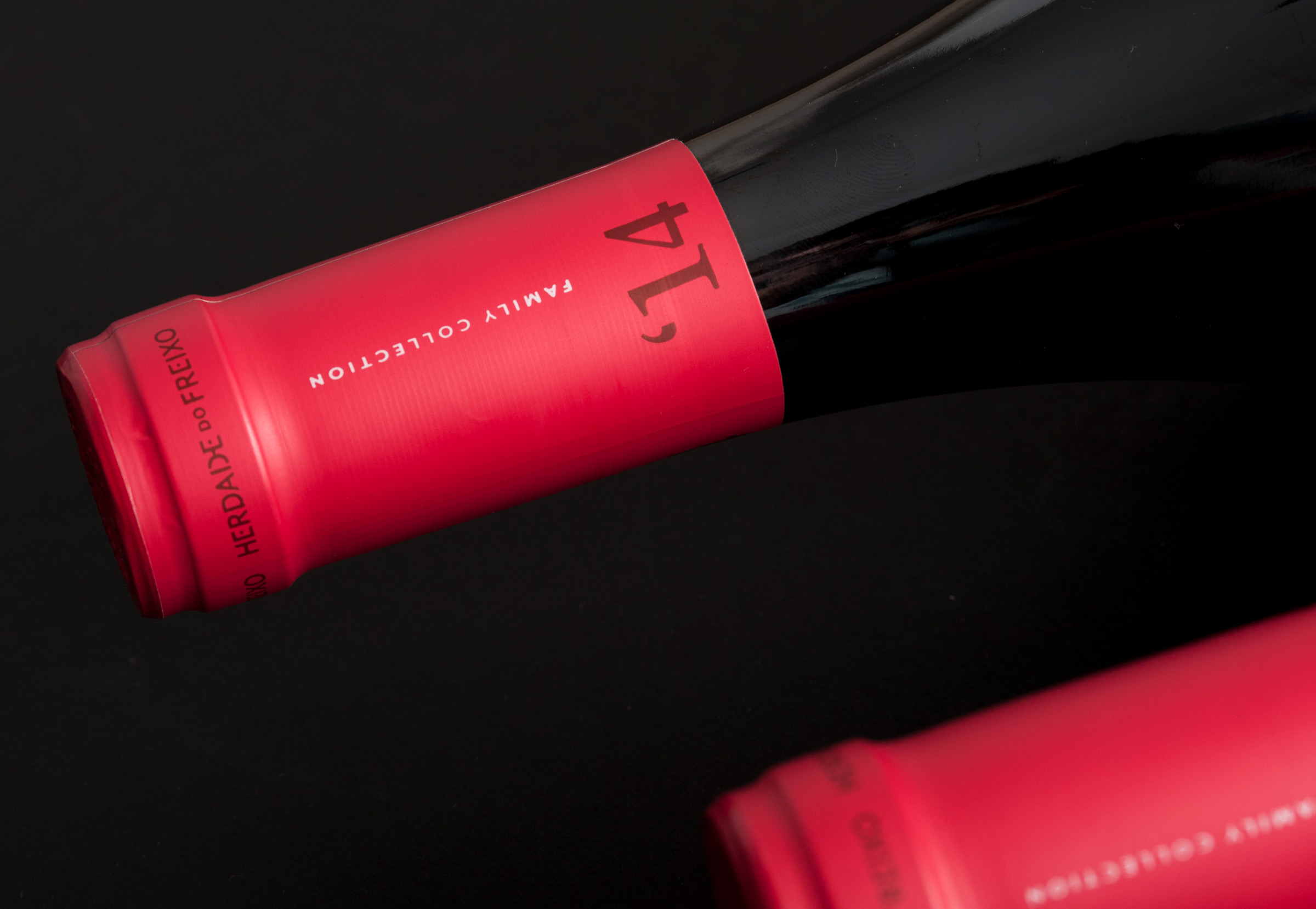
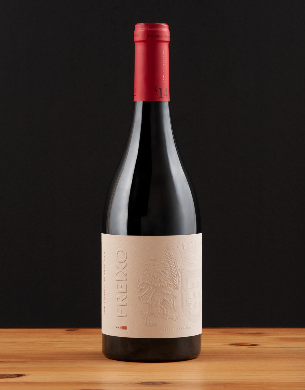
For Freixo’s hero wine label, we printed their crest in an extensive and detailed embossing.


CREATIVE DIRECTION Ana Freitas, José Pedro Gil
GRAPHIC DESIGN Ana Freitas, Lourenço Salgueiro
CREST ILLUSTRATION Christopher Wormell
SITE PHOTOGRAPHY Fernando Guerra,
Manuel Gomes da Costa
GRAPHIC DESIGN Ana Freitas, Lourenço Salgueiro
CREST ILLUSTRATION Christopher Wormell
SITE PHOTOGRAPHY Fernando Guerra,
Manuel Gomes da Costa